Alinma Bank Android App usability critique
This is a new week and a new review.
This week it's Alinma Bank,
I currently only use Riyadbank, Meem and Alinma Bank, so this is my final financial services application review.
This is a new design, around a year I think, and it's a huge upgrade from the one before.
I like Alinma's font to be honest.

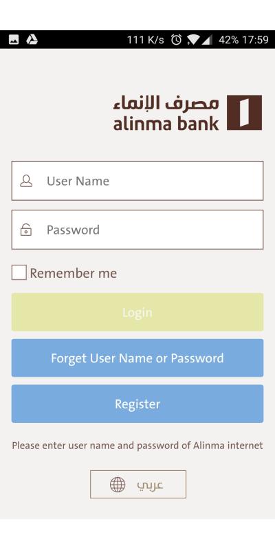
Simple and clear login page, I don't like the yellow login button, it is just too shiny.
I love where the button to change the language is, and it's clear and easy to spot.
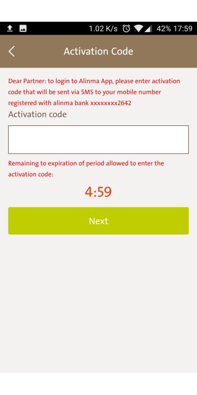
The activation code will be filled automatically which as I always said is a good move.
I just don't like how alarming the red text is, it's scary more than alarming.
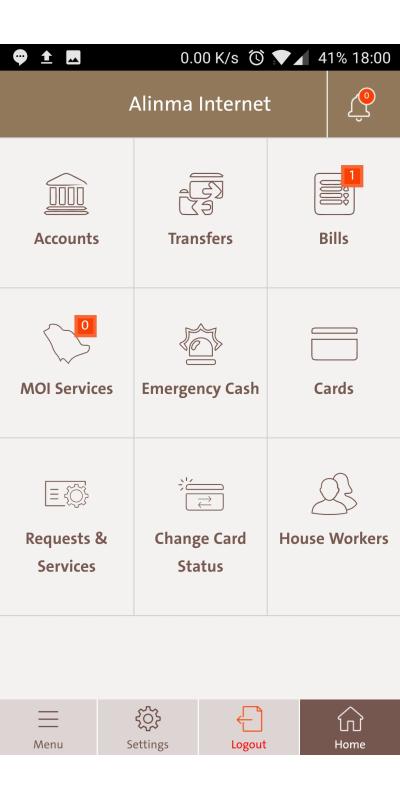
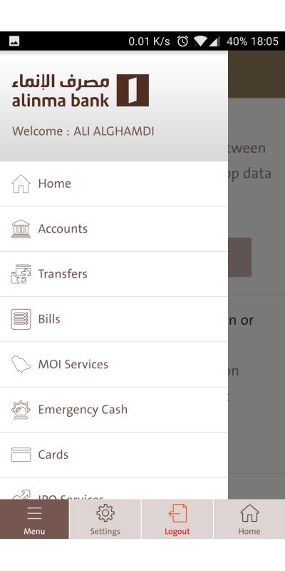
This is the menu, a grid of 9 buttons with all the functions you need in the account.
You can choose whatever and work on it.
A comment is on the bottom menu, how the home button in the English language is positioned right bottom, which is unnatural positioning.
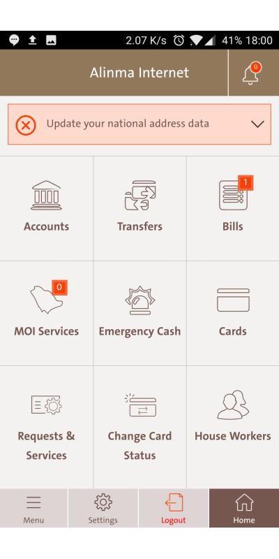
You get a notification to update the national address data, I did that behind the scenes, in a smooth and easy way. Although I would have appreciated if they added instructions for users on how to create their national address.
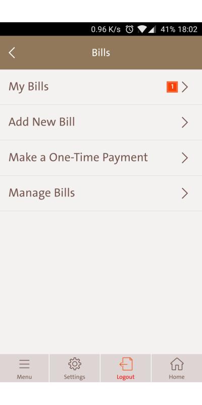
I chose the bills page, you get a simple list. There is nothing much to say about it honestly.
What I see common between applications and never understood, is why they separate between adding a bill, paying a bill, and so on. I believe all of these can be in one screen and easily accessible. I mean I can sketch in 10 seconds, what's keeping designers from doing this? I believe it might be regulations.
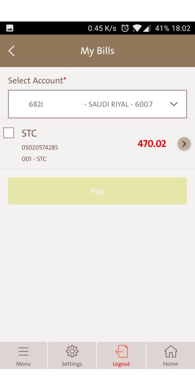
I chose to get into my bills, and I have a due bill... but I will be poor for the rest of the month, so no.
Note: to make a simple move to users, if the user only have one bill, why is it not selected by default?
In this screen I chose '>' to access the bill details.
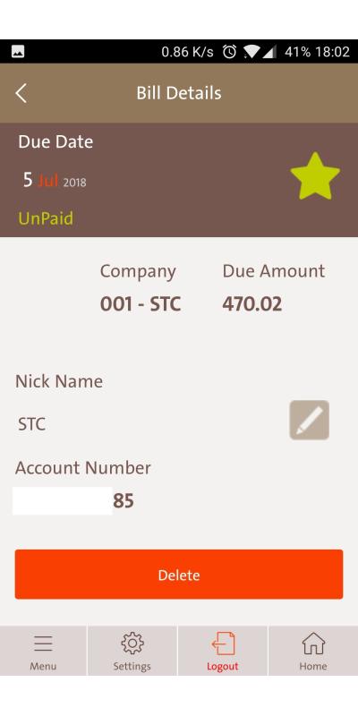
What's ugly here is that this the bill details page but I can't even pay here.
Not to mention the weird positioning, everything is weird in this page it feels like a university design project.
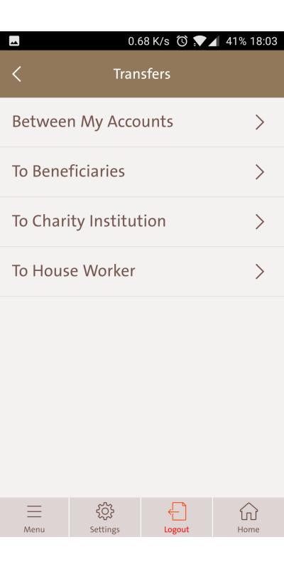
Here as you go for the transfers, the same big division of tasks that can be in two or three screens.
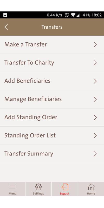
Same.
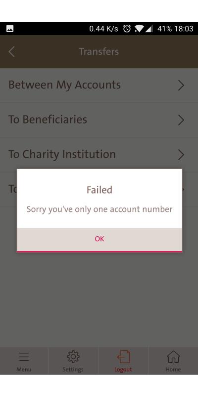
One thing I liked here is that if you choose between your accounts, and you only had one it'll tell you that. Simple and effective.
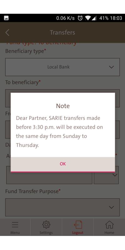
In making a transfer to to another bank, the application will send you a notification about how sending through IBAN might be delayed if you do it late. I like this. It saves them a lot of time of "WHY IS IT NOT THERE?"
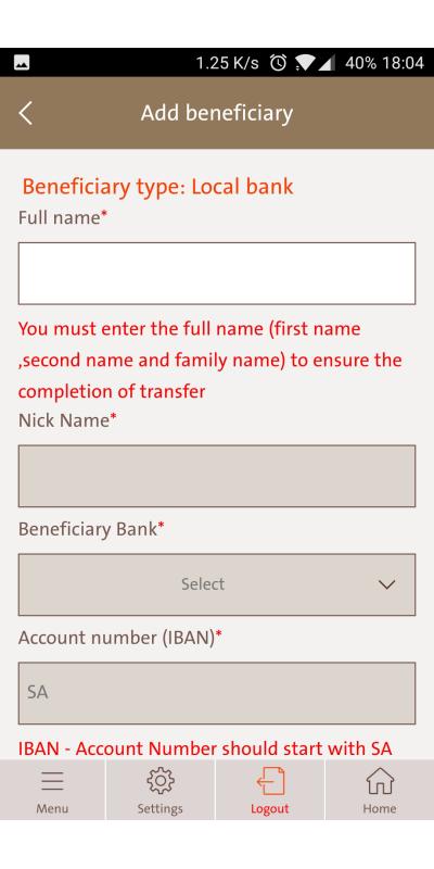
STOP USING RED. It feels like a Nazi regime in here.
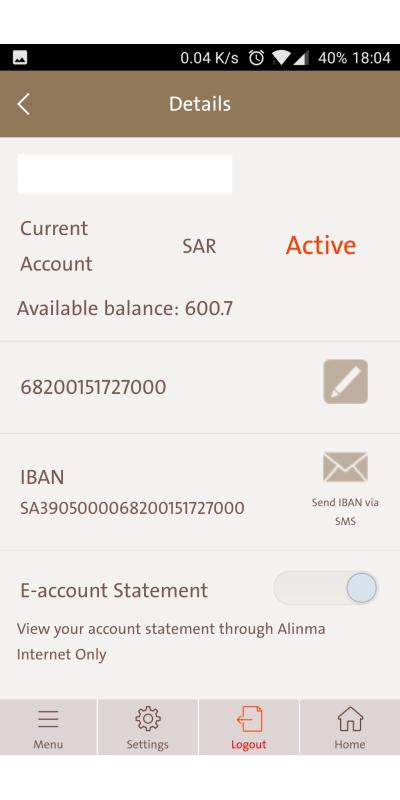
This is the account page, has enough information and it's what users look for.
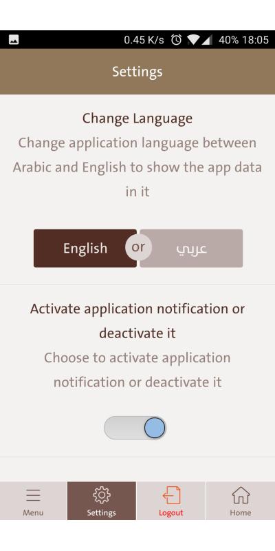
In the settings page very simple two options, portrayed perfectly. Great job here.
Repetitive menu on the side, so no.
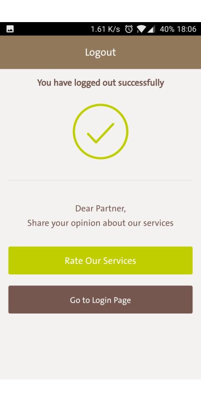
Once you log out they ask you for your opinion, a good move if the customer is too pissed or too happy.
This is a short interview, bank applications are so similar so I wasn't really excited to review it.
Waiting for a great product.