Carriage Android App Usability Critique
Is Carriage the answer?
Carriage started in Saudi around 4-5 months ago I think, and it started here in Eastern province. I was happy to see a new competitor to make HungerStation step it up, although there were other competitors but HungerStation was really leading all around.
It's true that Carriage is a Kuwaiti but we are one, right?
Now let's not discuss the backend and supporting services of Carriage, but let's dive in more in their user usability.
As a start I'd say the application is well-made, easy on the eyes and visually appealing. This is a good place to say that visually appealing has literally no correlation in my book with the usability.
I am a registered user, so this review just like HS review is built on a recurring user view, not a new user view, therefore bad experiences that are clear to new customers, it might be blurry to me.
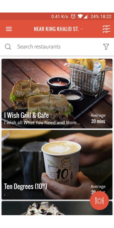
So the first thing I come across after opening the app is the restaurants list, which is my preferred option that I shared before with HS, that I like to see the options of my default location. Good experience is giving an average delivery time, and seeing that they follow up with it is impressive.
My main issue in this page is the offers, there is no clear way to know where are the restaurants with offers, and you have to scroll your way to find one that has an offer. I'm not sure if it is meant to be like that or not, but it is frustrating.
What I would invest in here as well, is to actually show the most used restaurants by a user higher in the list, at least one with option like "You might want to order from here again." I for example ordered from the same place for 3 days, 3 different orders, and had to scroll my way to find it, although I could have just searched for it in the topbar, but why didn't I do that is a question that has been bothering me, until I realized that the search bar is just there to be there, and at most it's there for you to use the filter. If you want your search bar to be used, it needs to pop.
Let's check the left menu, the menu is properly designed, the items are clear, the only issue here is that orders and saved addresses are also there in the main menu page, which can be okay in the case of users finding them lost, but if users don't use the sliding menu for that function, then these options being there is a waste of space.
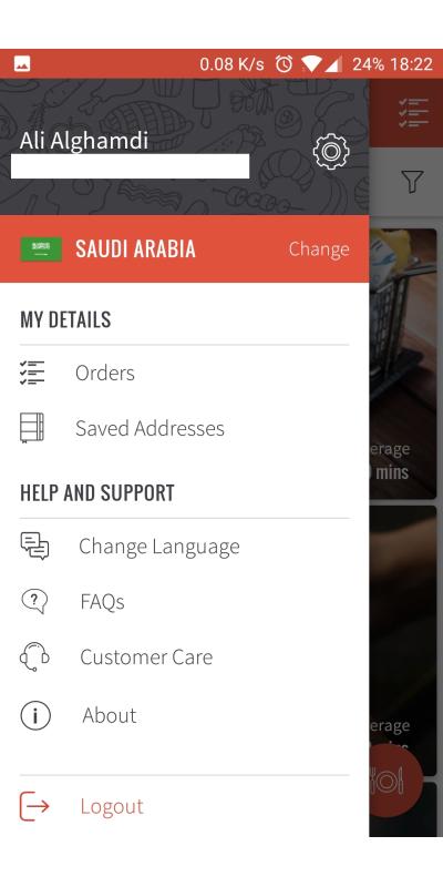
Let's choose the to-do list icon in the main menu residing in top right, but then you realize it's actually your current and past orders. Weird choice of an icon, but if it works, it works.
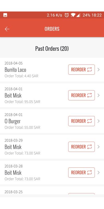
If you are wondering why I am ordering a lot from Beit Misk, the answer is simple, it is a great restaurant, try it.
The reorder option is great, and although I recommended it for HS, but there is one flaw with it, people might not use it. Again with most changes you need to test them before. What I would like to test if I worked with Carriage is to add a reorder in-app notification of the user's latest order when he opens the app for the first time after that order is delivered.
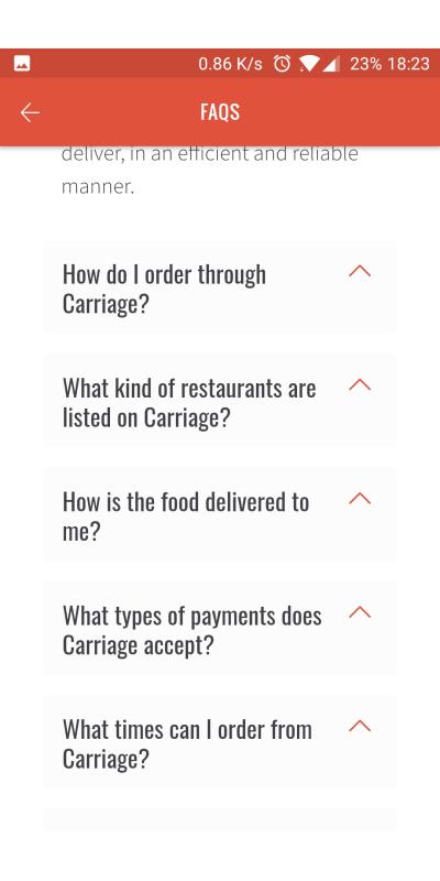
So let's go back to the left sliding menu and choose the FAQs, which is a good idea. There's not much to be said here, but it's funny to see the arrows aiming up while they should be down, it gets back to default after you click on any of them, quick frontend edit.
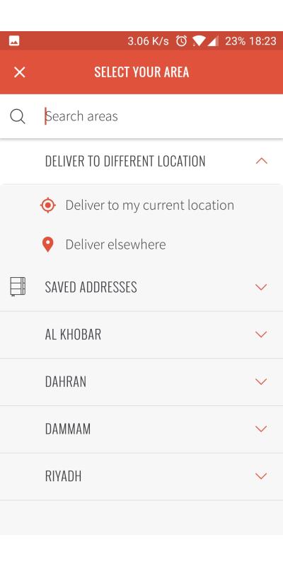
In the main menu, if you tap on the top bar middle arrow, this will open the address & locations page, which is clear, easy and simple to use, probably my favorite part in the app.
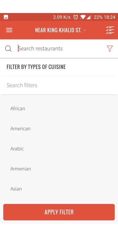
Now is the filter option, which is in the search bar btw, I know, it's hard to figure out.
This is literally the worst part in my opinion here, searching only by food cuisines? And it's not even a proper list, too many options, options that are not available in the restaurants in my area.
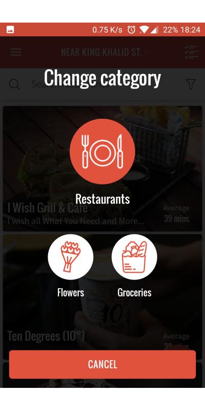
Well, if you check the main menu again there's a button in the bottom of the page, this is something that took me weeks to actually notice, until I figured out that Carriage has Flowers and Groceries options. Flowers are not part of this review, but I wanted to try the groceries options, and I was not pleased at all. You can NOT use the same listing for food for groceries. Restaurants menus are small considerably compared to what a supermarket offers. So it literally asks for a huge different design.
Let's go back and choose one of the restaurants, not advertising here, but I like this restaurant. Therefore, I always get excited to order from here, the page is clear, thorough and well-designed.
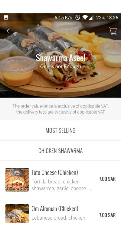
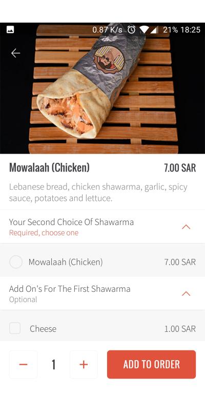
UNTIL, you go for one of the Shawerma options, which literally forces you to at least order two sandwiches to order this item. So I literally go back to HungerStation and order from them.
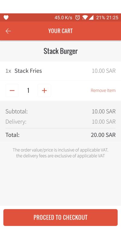
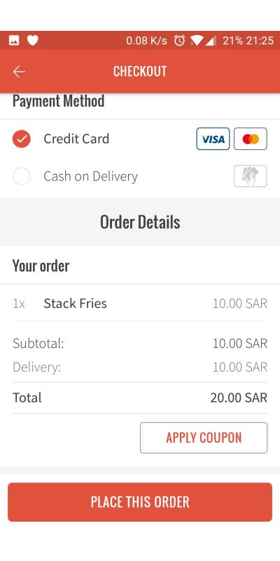
I went to order from another place, I chose the stack fries. Carriage forces you to use their delivery which has a standard fee of 10 riyals. Now that is debatable whether you find it reasonable or not, considering there are restaurants in the list who might deliver by their own fleet for a cheaper price. But I think Carriage wanted to take care from A to Z here.
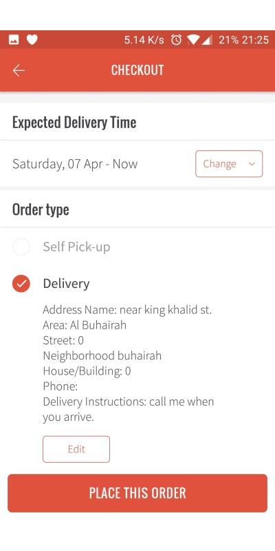
So to checkout we proceed, you can order for it to be delivered now or at your own preferred time which is a cool feature.
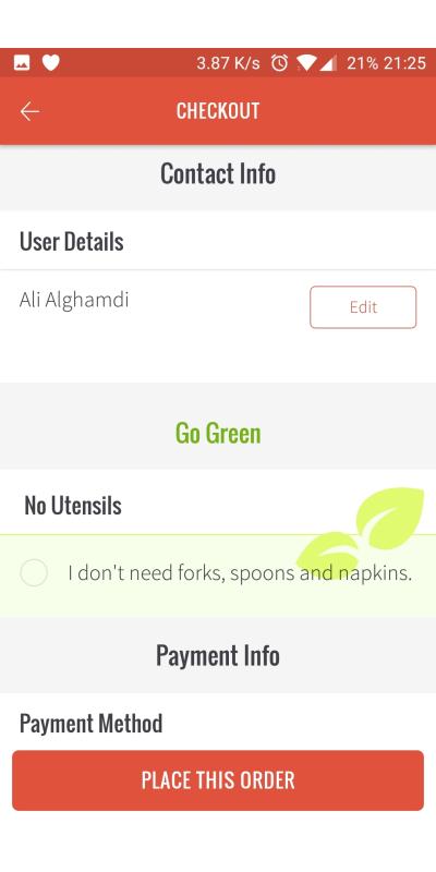
Now my issue with this checkout page is how long it is. It just feels like a page where they are going through everything again, it's a confirmation page apparently, but it is just so long.
You don't need to confirm with me my saved home address, or my user details, and cut half the page at least.
Carriage offers tracking the driver option, which is widely used without a call from the restaurant or the driver until he is at your place. It's a great feature. And lately I saw that HS offers it as well for their drivers.
The issue with Carriage is that you don't have a way of contact with the driver until he calls you, which can be frustrating.
Another issue with Carriage which HS also suffers from is the in-app support, no agents available and it takes forever to get an answer from them.
Although to be clear, there was an incident where my order was 3 minutes late and they offered it to be free by a phone call, which is respectful and caring. And if that is the new direction, that will be great.
I still feel like this application offers a lot, but as I said last time with HungerStation that this field misses innovation, all of these apps are just working like you expect them to be. And there is still time for someone to make a difference here.