Dokkan Afkar Android App usability critique
Dokkan Afkar is a very interesting online store, seriously well-done and always trying to keep in-fashion.
They sell what's considered "cool" and that clearly has been portrayed in their design. Now just to show how outdated I am with this store, this is my first interaction with this design, whether in laptop or on a smart device.
This takes us to their Android app. After tapping on the app icon in my Android launcher, I get their logo and then what I consider a one minute white break. It was stuck on that white screen for at least a minute, and I'm not sure if it was due to the fact that this was my first run, and it was downloading what seems to be a web app, because in the second run, it worked quite fast.

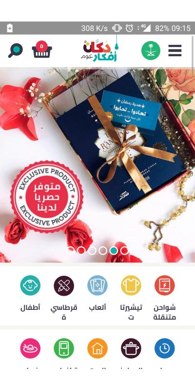
Then it opens up, you see the main screen of the app, now clearly it looks like a web app, which is not ideal but not necessarily bad! Although in this case, I don't have a lot of confidence to be honest.
Few things I don't like about this page:
- It's cluttered, too many colors, too many options.
- I don't like titles that are cut, as you can see clearly in "قرطاسية" or "تيشيرتات". Now it could be that I'm annoying and hard-to-be-pleased, although that is what I get paid for. But it's annoying.
- That this page scrolls for long.
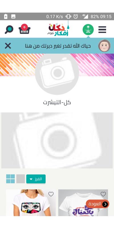
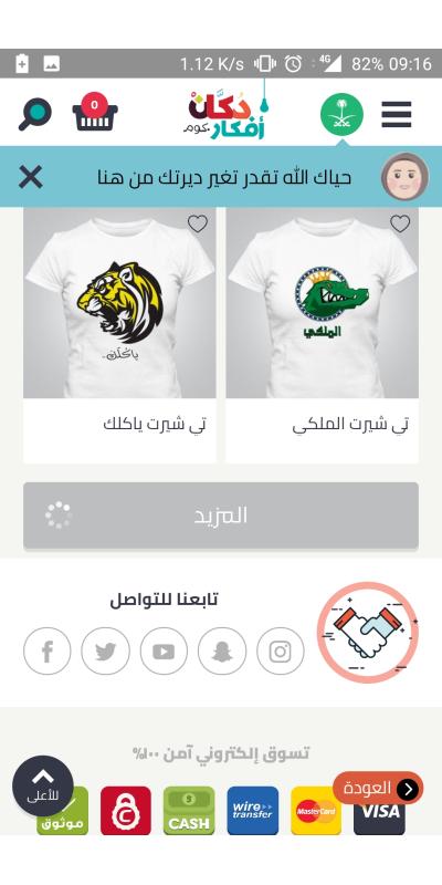
Let's just jump into the t-shirts page, I got welcomed by a placeholder photo and that doesn't build confidence in me.
There are the known sorting options, and the viewing options for items, which are critical and they are actually well-presented here.
This review is becoming a review of their web app design and not the android app, so I will change how I judge things, although I'm not really a big fan of doing so.
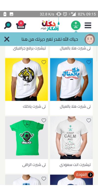
They offer a wishlist option, which is great. But as you look here the button to "love" these items is too small, plus if you miss it you will actually open the item, which drives the user in the wrong direction.
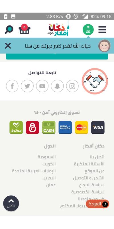
You get the footer of the web page in the bottom, with a button to go back to the main page, and another to go to the top of the page. Few icons to tell you this place is secure, which does help users.
Load more, a normal button you see. It doesn't work here, at least for me which is really frustrating.
So let's open the menu, let's see what is in there.
Alright, decent piece of information, with an informal way of saying things to depict the cool factor.
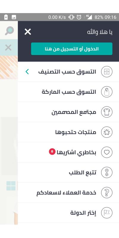
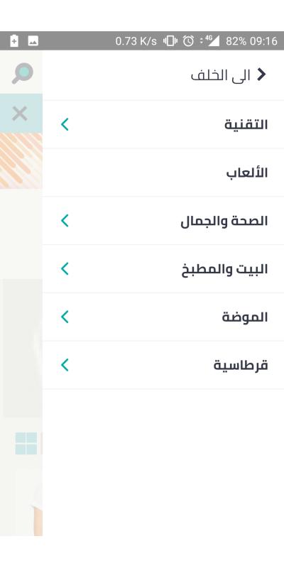
I spent a few minutes in this menu, properly structured, clearly following best practices in that.
Outside this review, do you use UX best practices for everything? NO. It is a good place to start and try, but every business is different and that is where you should improvise and build something better.
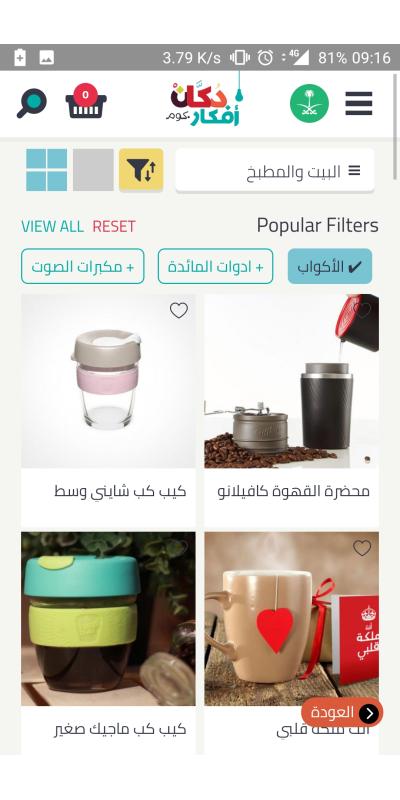
Now I decided to look for cups, which has a different product presentation, and I actually like this way more than the one earlier in the t-shirt section. Although, to be clear the experience should be consistent, so I would use this one instead of the one before.
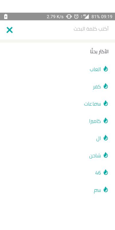
You get popular filters, which is a good way to let the user know what people usually look for.
I chose the first item, and you get a basic and clear product page, you get the normal add to cart and the express buy option.
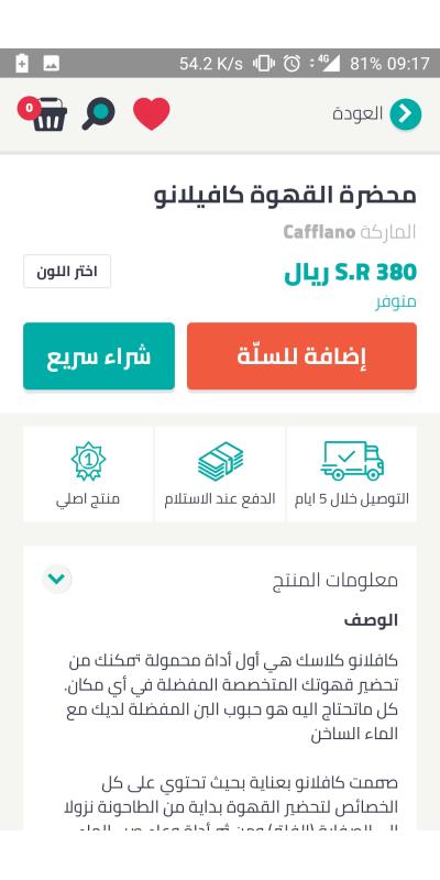
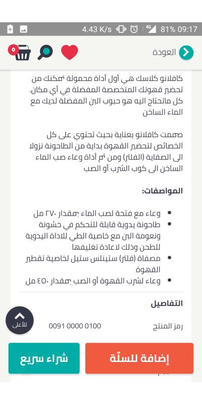
Now, I started scrolling down to read more, then the action buttons followed in the bottom waiting for me to add the item. This is a good move, not just for the business but for the user as well because it's usually there at the bottom of the page where they actually make the decision.
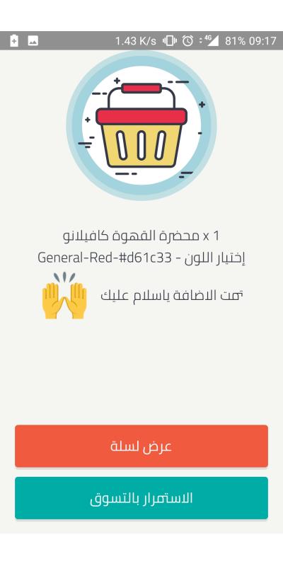
Once you add an item you get a new page to tell you that hey you added the item, do you want to check out or keep shopping?
Here is a place where I can't comment unless I see the data, if users usually leave their items unattended in the cart, I would use this option. Otherwise, I would just add a basic animation that shows it went to the cart.
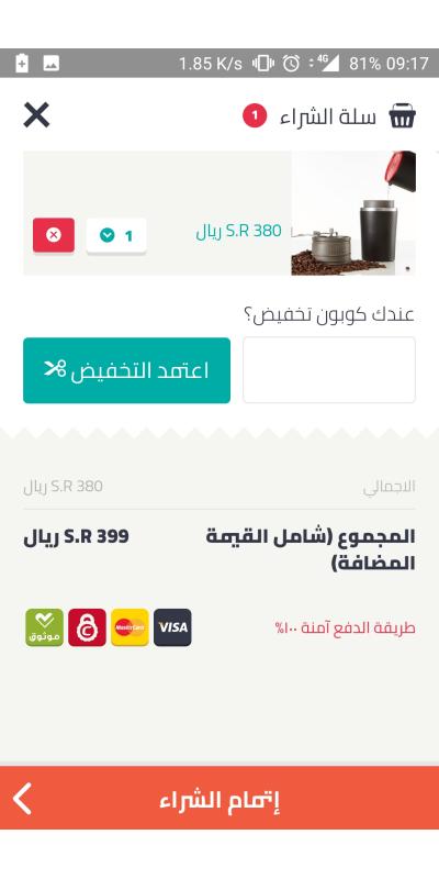
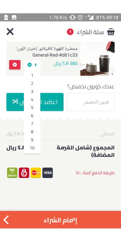
Now I move to the checkout page, you can see clearly in this page that the title of the item isn't there, and there is no place holder text in the coupon field. But if you look in the next photo you will see it.
It took a bit of time to show.
But overall a decent page, the price is shown in bold. They reassure the user that this website is trusted.
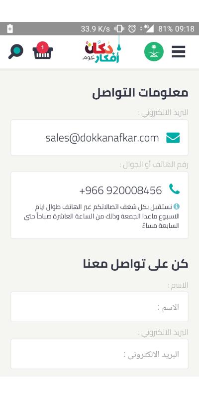
I went to check the customer service page, which is a decent one, offering all kind of options to the user. Reassuring the user, that their service is important.
In the end let's just see what they have in the search page, you get the search field with the hottest search items. It works, it fills and it sells. It's okay.
Overall, this was a nice experience. Other than the fact that I was disappointed to be using a web app, I think everything else was okay.
But as always, if things work okay, they can work better.