Jahez Android App Usability Critique
I'm pretty sure you all are thinking this guy eats more than he works. Which I can say for sure it's not true, sometimes.
Anyways, this review subject is Jahez, I came across this when I was really hoping some app has the restaurant that I like in our neighborhood, but apparently they are too proud to use technology.
I remember opening it once, and it was really basic that I quit it. But since I am a person who rarely deletes apps, I came across it again, and to my surprise the app has changed for the better. I still think they can improve the UI design a bit. But I'm not in no position to evaluate that, we will talk about my experience with it. And what I think could be improved.
Now this review is different than the two before, luckily I haven't registered this app yet, and it's a new version of it. Let's dive in.
We open the app to face the landing page which is a disaster to be honest, I almost thought of deleting the app here, but I'm glad I stayed. The logo isn't clear, I'm certain the word Jahez in Arabic was in red, that's why we can't see it. And then it just says accept permission, accept what? What permissions? If I tap here will it somehow access everything in my life? You won't know until you tap on it. Which then opens the default Android permission pop-ups, asking for the location and phone permissions.

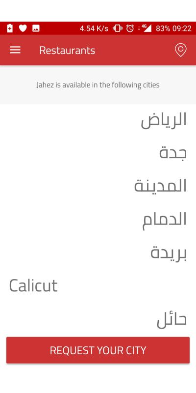
Next page is the cities offered by Jahez, great, I keep tapping on Khobar and nothing happens. I double tap, long tap, nose tap, danced around the phone like musical chairs game and nothing happens. I literally restarted the phone thinking something is wrong with my phone.
Let alone that this is the English interface, why show the names in Arabic, and let's just guess what that city that's in English.
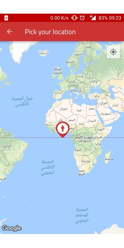
Okay, I give up I'll go for the location icon top right, now I had my location off, therefore, it's normal the map pointer doesn't reach my home, but you would expect the app to ask you to enable it.
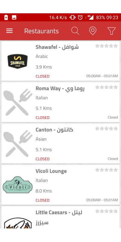
Now here is the restaurant list, few points here
- It shows how close the restaurant to you, this is honestly useless, if you build your ordering on how close the restaurant to you then you are doing it wrong. An average of delivery time would be enough. If you want to be fancy, put an average delivery time to the user's neighborhood.
- The Arabic and English names are there, I don't know why that is the case, but I assume it's there by default.
- I always say when you don't have enough data for a feature (in this case the reviews) then hide it until you get enough data. Zero stars look like it's a very poor rating, not that it hasn't been rated before. I would change the rating system here, use a binary system or out of 10. Why out of ten? Because it takes less space and you can highlight it, if I see yellow stars again, I will probably throw up.
- Closed mentioned twice, and two restaurants open from 5:00-5:01am. Okay.
- I would pass on pictures not being there, but for restaurants that are famous, it's just weird.
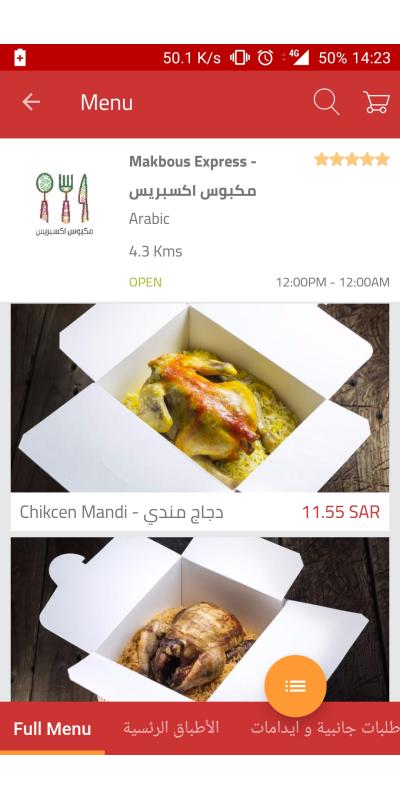
This is a clear good menu, well designed and well-built. This is pre-registration menu, we will go back to this later.
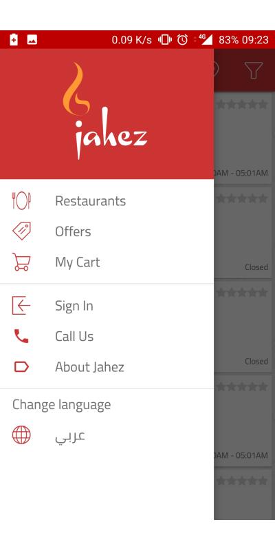
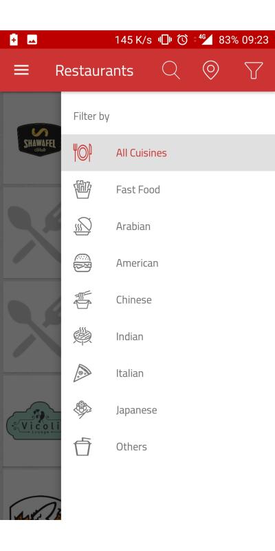
I like the filtering menu on the right, it's clear and easy. It doesn't take seconds to get the whole thing around.
To take a minute here, I love the options in the top bar menu, enough and clear call to actions, it could be debated that it won't work, but I believe it will work perfectly.
So I waited until noon to get a clear look at the restaurants, this is my first choice, when the page opened I was impressed to be honest. But then all came to dust, the horizontal slider for the menu is located at the bottom, which is a big no-no.
But the pictures of food and the clear names are good, until I noticed I was using the English interface, yet this is what I got, Arabic slider, and again the same issue with restaurants list, offering both Arabic and English names.
Look in the screen above, do you see the the yellow button hovering over the bottom sliding menu? This is a bottom to change between a list or cards style for the menu as shown in this picture. I personally think it's useless, but that's just me saying.
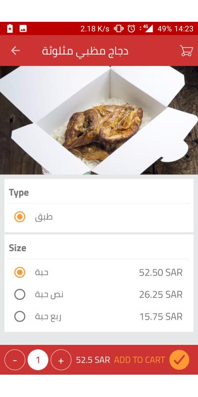
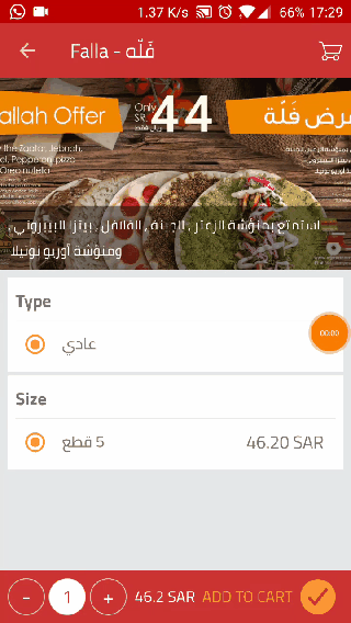
Alright let's get something to eat, so the order item page is clear, easy and the thing I would do is to make the bottom bar a bit bigger.
When you tap on Add to Cart, it just shows in the cart top right. Here is a good use of animation, is to show that the order went to the cart. Most designers will think it's intuitive. Although, I'd say usually issues like this are because of the programmers avoiding doing extra work, thinking it's not worth it.
GIF, look how it just becomes 1. No animation.
This is how the cart looks.
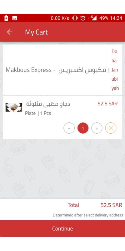
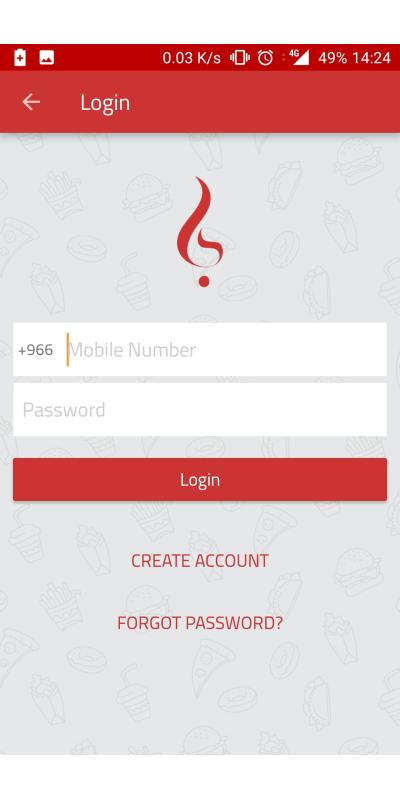
So I choose to continue ordering, they force you to login or sign up. You can't continue as a guest, which I assume is a move so they get users signing up.
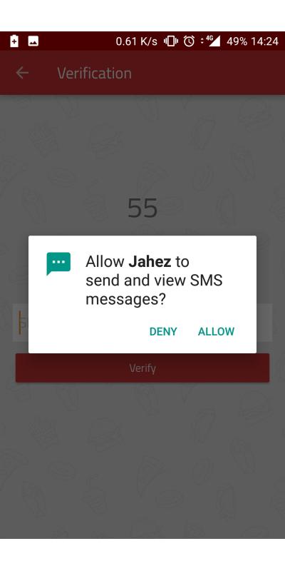
I created an account and then you get a verify your phone screen. It first asks you to allow Jahez to access your SMS messages. Which is good, because it means it'll fill the field automatically and you won't need to enter it yourself.
But to be honest this countdown timer is scary, and one minute is just too short of time.
It asks me again for my location, although when I started the app, I did choose it. But asking again for the function of adding an address, this should have been done when I was starting the app, not twice and now.
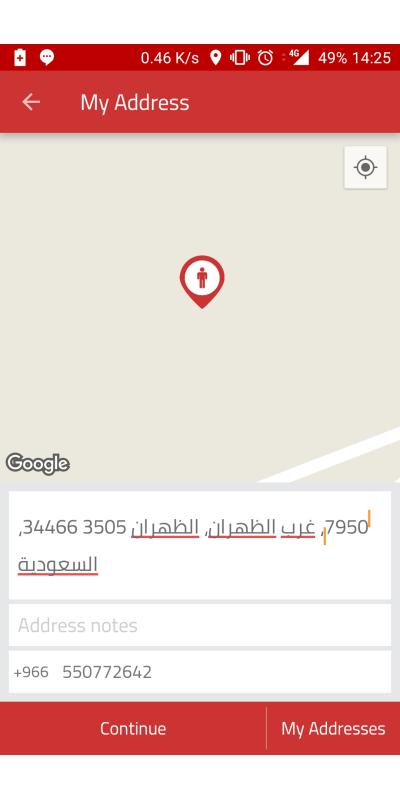
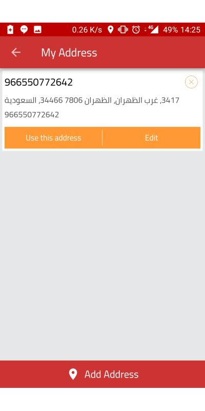
Two steps to choose an address, there is no need for that.
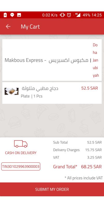
This is the confirmation page, I didn't submit the order, but as you can see, it just checks your order unlike what Carriage double checks everything, probably asking for a photo of your ID as well.
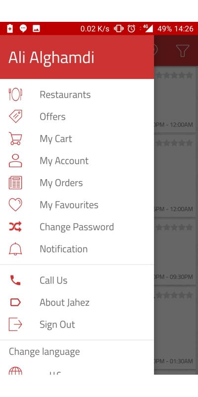
Now just for reference this is the menu of a registered user. Which as I said before is a good menu, although I don't get why there is a notification button. But okay.
I know I keep saying two steps are not needed, and it seems like I sometimes encourage having everything in one screen. This is always a debatable issue, my take on it, is test, test and test. Probably a lot of people remember the 2 clicks rule, which everyone thought is amazing, it is amazing, only if done properly. Otherwise, it's just a disaster of information archtiecting.
My advice is to start with the basics, then cram the page, then take things out as you test. That's my 2 cents here.
I wish the best of luck to Jahez family, and to see them flourish and come up with innovative ideas.
They definitely rocked at some areas, and had rough edges at others, but still great efforts.