Nana Android App usability critique
It has been a long time since I wrote one of those reviews,
We are preparing a good distinctive and special program for expert paid reviews, if you are interested please hit me up at twitter. @AliAlghamdi
As for this time, we are reviewing what's now becoming one of my favorite Saudi applications, a well-made application with very good support and awesome people behind it, who unfortunately I only know by names. But kudos!
So let's cut the introduction and start the main course.
Do you see how beautiful this first page is?
The first call for action is clear and simple, you can do this without thinking twice.
And there are two buttons under, one for English speakers and another for checking their inventory, which helps those unsure whether they want to sign up or not. This page in my personal opinion is the most wholesome page I have reviewed yet. Their tag line is clear and gives an idea with the photo about what they can do, signing up and signing in are joined in one simple field.
Some might argue that having signing in and up in one field can be confusing, it might be, this is where data is the key identifier here.

You get a confirmation by SMS screen, simple, and again with the one minute scare. Good point here is editing the phone number button which is actually a brilliant idea, I hate how I have to go back and change it, but they counted that humans make mistakes, which is considerate.

This is where I think they could have avoided this step, although it's known for marketing purposes to push for the users to give their name and emails as soon as possible, that's why you have invitations to newsletters as soon as you get in a new website. And it's proven to work for marketeers, and this is where you have your trade-off, if it hurts your experience less than it makes you money, you can do it.

You get then this page to choose your location, and as I always say, tell users you want access to their systems, that's why you see here Nana asking you to activate GPS before the system asks you for it, this is good experience.
And there's an offer to fill it manually, another good option.

After choosing the location, you get this homepage, where things get a tidy bit confusing.
Now Nana apparently offers more than just Nana grocery shopping service, where they also have water, recharging cards and I got a notification about a pharmacy which to my disappointment apparently was just a false notification. I know it wasn't april the 1st then, therefore I am deeply disappointed.
What's also interesting is that they show the options for paying for each store, as it shows in the screen.
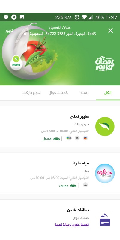
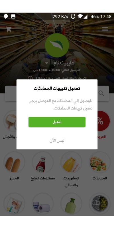
Again, this is the same good experience mentioned before, Nana asks you to approve if you want to enable notifications since the delivery guy can contact you in some cases.
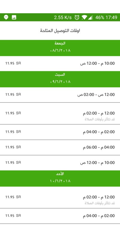
If you click on the time, you can see other time slots available, it's clear if there are prayers in the middle to tell you prayer time can cause a delay.
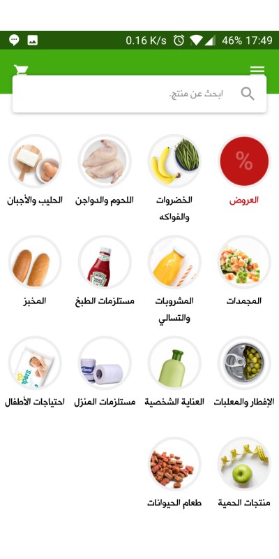
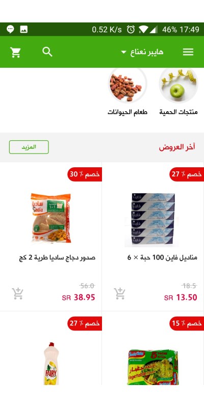
In their grocery shop you see the following items, in a good categorization that makes it clear for customer, with the option to search clearly.
In the offers page is all the items and their prices, divided in a grid list, with an easy to access add to cart button.
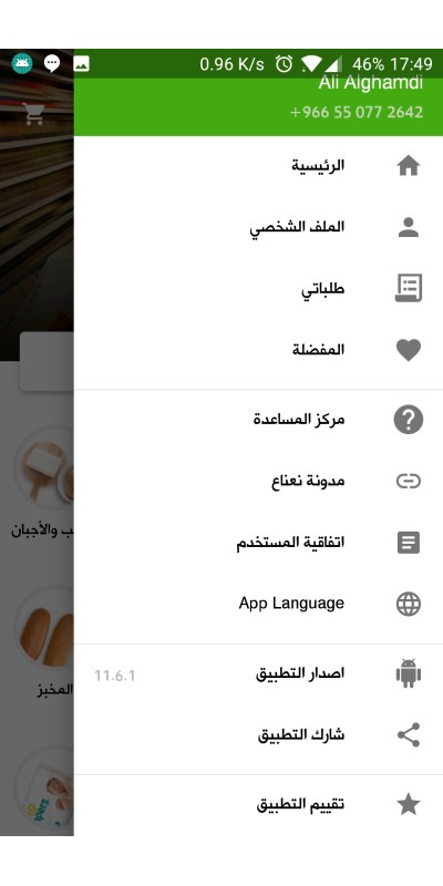
In the menu you get all of these items, I believe they are more than they should be, especially the application version field.
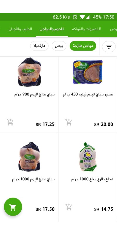
I went to check poultry, it has subcategories up there to help you get an easier access. It's a standard way to doing lists lately, one that I'm not mad with at all.
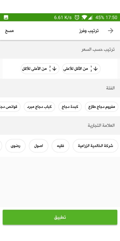
I like how the filter page looks like, very minimal work from the user, with a lot of informed options for filtering.
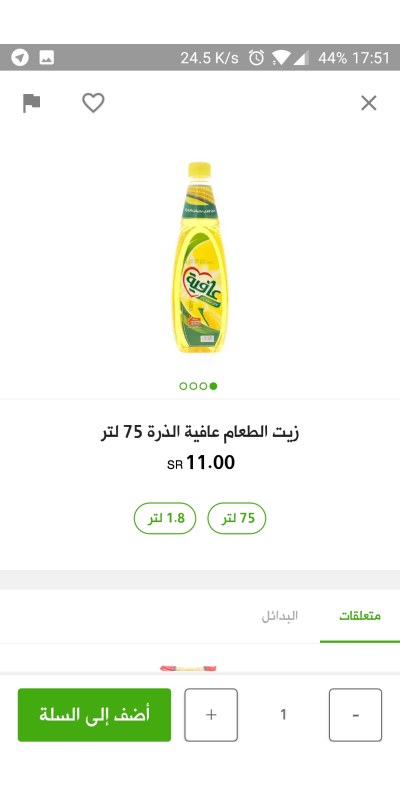
This is a product page, with a clear add one or more items to the basket, you get related items, and in some cases alternatives which is also a good work.
Up on the left there are the favorite and flag buttons, the favorite is a good option for later ordering. I would have appreciated a list that's more like my weekly buys, and that I click on that once a week.
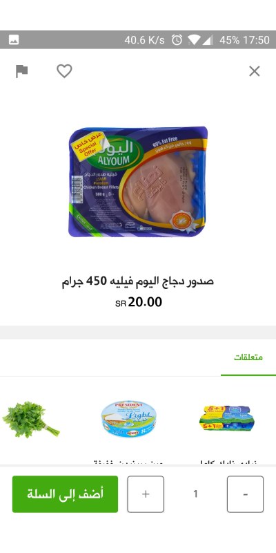
Like in this page you see you have multiple images, the options of this item and alternatives.
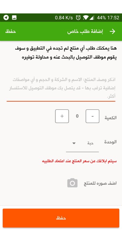
Jumping to the end, Nana gives you an option to add a custom order, for something you didn't find in their store. Which is a nice move from their side.
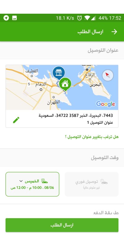
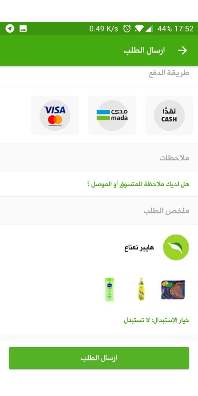
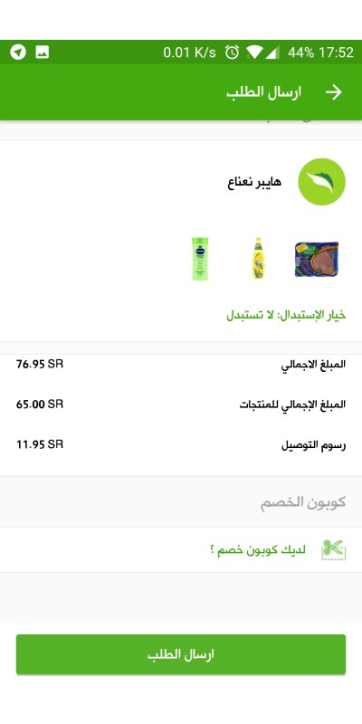
As for the last step, you see what follows:
(In the next few screens)
1- A confirmation of the location. 2- Delivery time. 3- The payment option. 4- And a summary of the order.
What's nice is that they ask you whether if they don't find the item you want, they can replace it or just cancel it.
Overall, this is a really neat experience. The great work done by Nana team is clearly showing, it's a clean looking application with its features showing as needed to the users providing a clean look.
There are some things that they can definitely improve, especially with some scrolling lags in the application. The chatting window isn't ideal as well.
But I'm really glad to see this amazing work. All the best to Nana team.