Riyadbank Android App usability critique
In our journey to find what's wrong with banks we are now investigating this very populated area that doesn't have any winners, as far as I know, correct me.
I have been a user of Riyadbank for the last 4 years or so, and honestly it's alright, there's nothing amazing or something bad. I use most of their services and I owe a debt I wish I can clear as soon as possible, maybe they will like this review and take it off my back?
Well anyways, banks in Saudi are restricted by a lot of rules SAMA is forcing on them, and most of these rules are actually endangering the experience of the users, and I just wish they change that. As I've been told SAMA has improved a lot recently, and caught up with the new technologies, so that's a good thing.
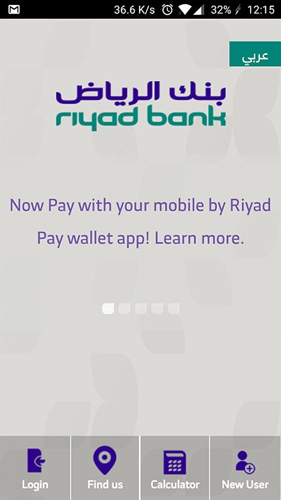
Now we start here with this awful mistake, advertising their services, as a bank user I am expecting to see a login screen so I get on with my business, not a slideshow.
They offered a small list in the bottom, which is alright, keep it in mind.
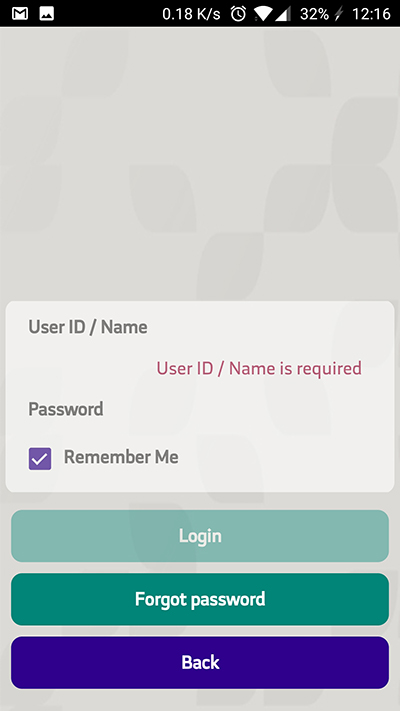
Normal User ID/ Name page which I'm still wondering what's the differnce and a password. Nothing much to report here.
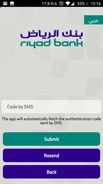
When you submit your login the server sends an SMS to your phone, and uses your phone to fetch it, pretty neat. I always appreciate this move, especially when they ask you for your permission.
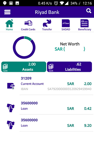
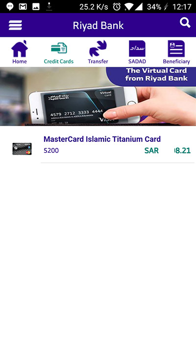
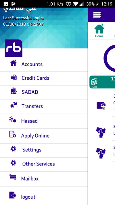
Now this is the home page, where the real stuff are. Neatly done, precise, clear and to the point no complaints on the data.
BUT
We had a bottom list before, now we have one above and another on the left? Oh and there's more to come. Inconsistency is horrible.
And this is where the credit card information is, and this is still puzzling me, why wasn't it added to the home page?
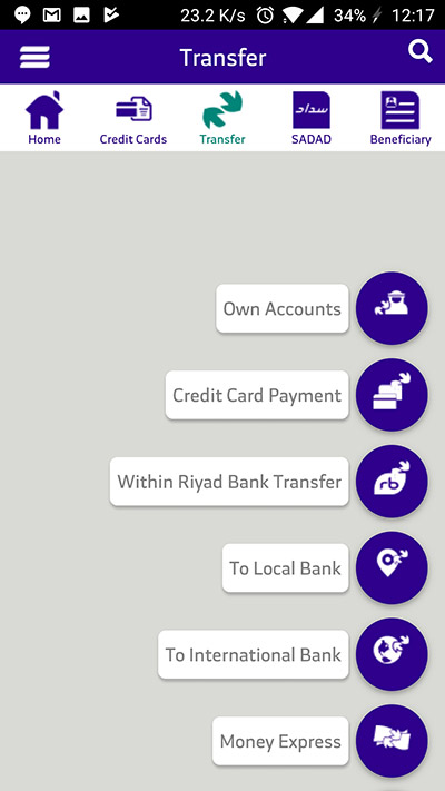
To be in the flow, we are now navagating the top list.
Now when we choose transfers we get this, now we added a new list to the collection, Riyadbank designers used every list possible in the design book. Confusing, as confusing gets.
Here's a bit on writing for your UIs, be clear. BE CLEAR.
When you enter a transfer list and there is a button that says "Own Accounts", I just don't know...
It should clarify and add few words to clear the confusion, "Between your riyadbank accounts" and the rest goes for this list and the lists in this app.
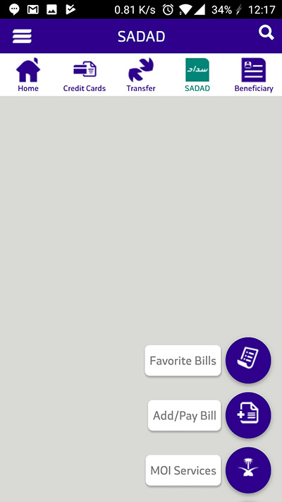
Let's navigate to the SADAD pane, there's this division of tasks that I fail to understand, but somehow got used to it, now I can't complain because I'm too used to it. (Lesson #1: if your users are used to a flow, and you change it radically because you believe it will help then you are clearly making a decision that you care more about the new users, not the current ones. I mean it's debatable but in most cases it's that, take twitter for example.)
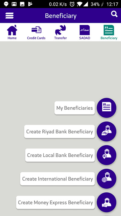
Beneficiaries pane, same thing, now to be clear I believe Riyadbank designers are wasting a lot of their space using a weird design.
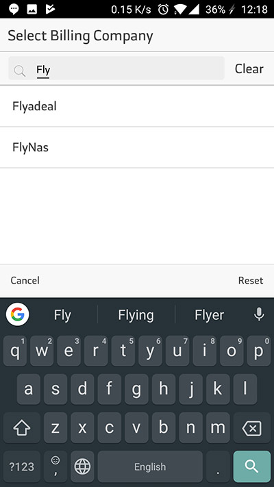
I actually was going to pay my Flynas SADAD bill for a trip for Jeddah in July, as you can see the page that's where you pay or add a new bill. Now my issue with this is that I always like to see cateogrized lists, so I would have appreciated a categorization of companies/entities in this page.
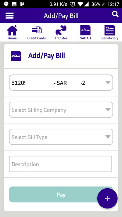
But they provide this search bar that I overuse to be honest, although I'd really appreciate the chance not to write anything.
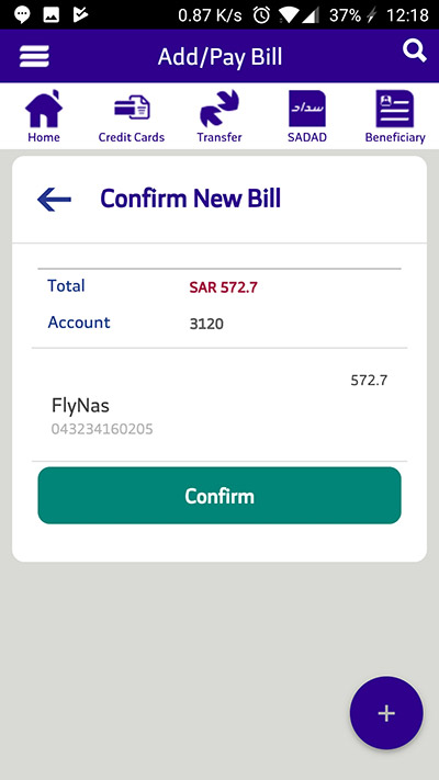
I added the information of my trip, and you get a confirmation of the task, which is SO IMPORTANT in financial transactions. Always have that in mind, the user might be frustrated of how many times they are clicking too many buttons, but they will be way more pissed if by mistake they made a huge purchase.
Now this is something I only figured when I was testing to be honest, and I have been using this design since the day it became live. It's the search functionality in the top bar, which I just found out useful that is.
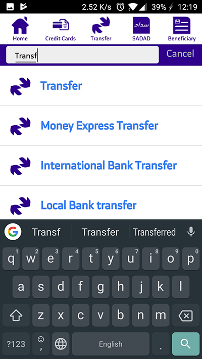
Now here's where I get mad, do you see the duplicate entries in this list and the one we saw earlier? What's the point of this duplication?
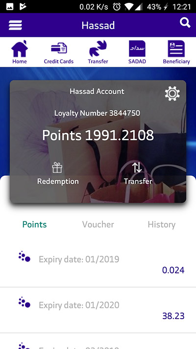
I decided to check my Hassad points, and I left my loyalty number there in case you want to send me points, I'm looking for new glasses and they are a bit expensive. So...
Now I don't really have an issue with this page in particular, but I have an issue with it being inconsistent with the design.
Riyadbank application seems to be the effort of 4 designers who don't communicate.
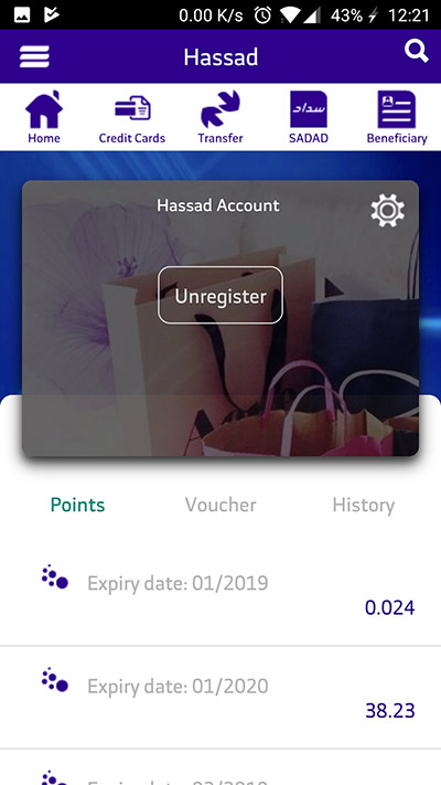
Guess what does the settings button up there does? Brings you unregister option.
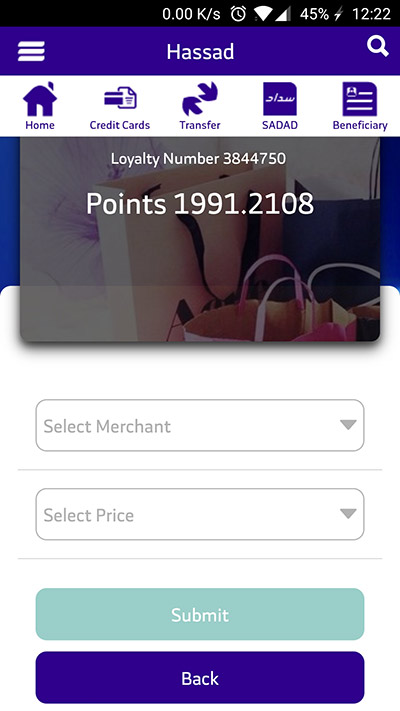
As you saw in the screenshot before the last, there are two options, redemption and transfer, well I chose REDEMPTION. I just like the word so much, can you blame?
Now Hassad is Riyadbank's rewards program, and this is where you redeem your points, wait, you first actually have to apply from this app, then go to the ATM to get the voucher, and you can't make two vouchers in the same time. It's a tedious process. And I guess fixing it is not a priority, right?
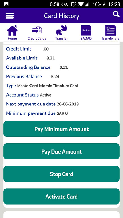
Now in the credit card page, I chose my current credit card and this is what you see. I mean other than the confusing buttons, it's fairly okay. You have a button that says Activate Card the thing is that the card IS ACTIVE, do you see how confusing this is?
Now what I do in these reviews isn't suggesting new designs, I'm not responsible for that. Unless you want me to help, then contact me. But these are reviews where I just share an opinion that's not backed by data which might be false, so take it with moutful of salt.
Riyadbank application is only good because the one before it wasn't good. And I am too used to it now.