toDoorstep Android App usability critique
After spending weeks immersed in researching Hadoop for installation, I didn't find time to breathe.
And now I just did, barely, so I was in Jeddah last weekend with my family, and I thought to try toDoorstep, after I became an avid user of Danube and Nana, I found out I have toDoorstep, and also realized it delivers to my parent's. Therefore I used the chance to review this.
I have no idea what toDoorstep is other than being a grocery shopping service, and because of how beautiful the brand looks, I had high hopes.
Let's get to our review.
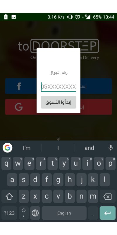
The login page, a cute lovely page that I am not very fond of. If you read my earlier reviews, especially the one about Nana. You would know how much I love phone number sign ups. What surprises me the most here is the facebook option, I don't know if I'm imagining things or that facebook is almost never used here, so why add that and not put twitter?
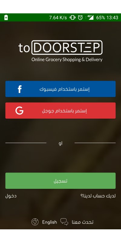
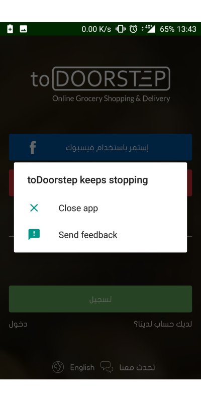
But anyways, I actually tried facebook or google? I'm not sure, but one of them kept crashing on me, which disappoints me.
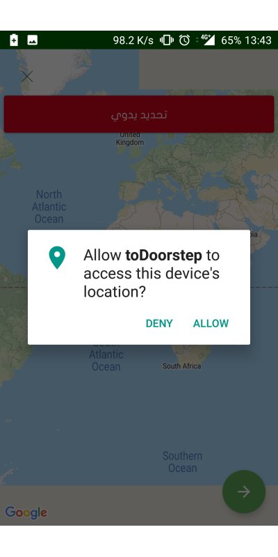
I used the normal signup, and went to where I am supposed to share my location, a prompt asking to allow the app to see my location, which was okay, although I always appreciate a user warning about this before the prompt.
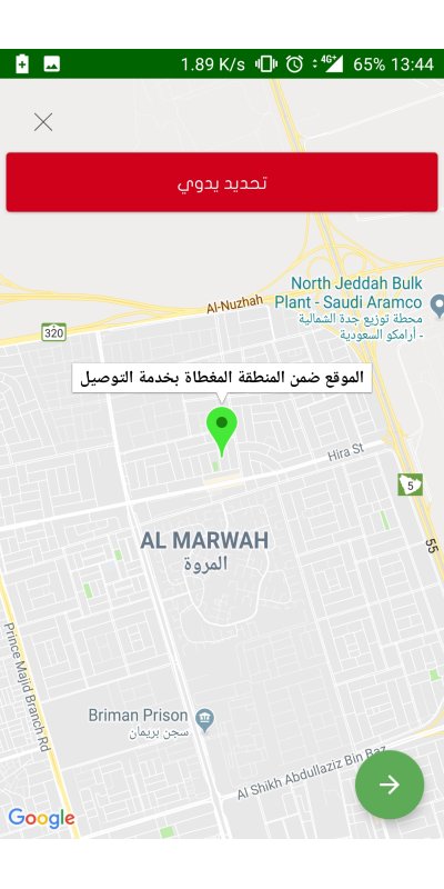
It got the place, and it shows that a delivery is possible to the location. What's unfortunate is that when I tried it in Khobar, it failed to locate automatically, and I even restarted the app few times, I guess it's a bug, but that is not part of the review.
In a very small prompt it asks for my phone number, and then it asks US to start shopping, although there's only me.
And with that it brings up the full keyboard, which is a mistake, it should bring a number pad.
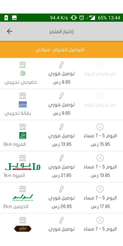
A list of stores appear, I love how it shows the options of delivery clearly and with a price estimate, but it looks like an excel sheet which made the page look cluttered.
I chose the second option.
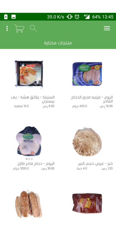
So after choosing the second option you get a list of groceries, I'm guessing it's a featured page.
The weird part here is if I hit back it will leave the app, why? It should take me back to the shops list.
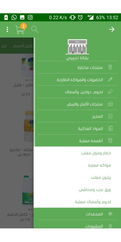
Pulling the menu on the right shows categories, it's a normal design and no comments are worth saying here.
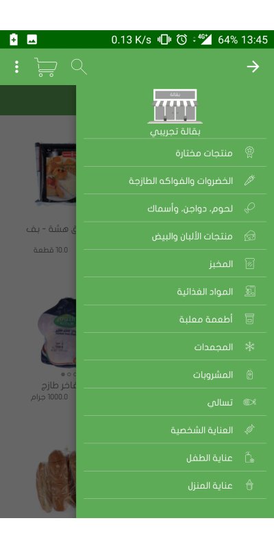
Now there is another list on the left, which has a different design than the one on the right, which a bit confusing, yet teeny tiny accepted, maybe there is a reason I'm missing.
There is a clutter of features that are truly unneeded, my lists, my recipes, my orders and my old buys. All of those can be matched in one or two at max.
And "Help" with "Talk to us" seems like a weird combination.
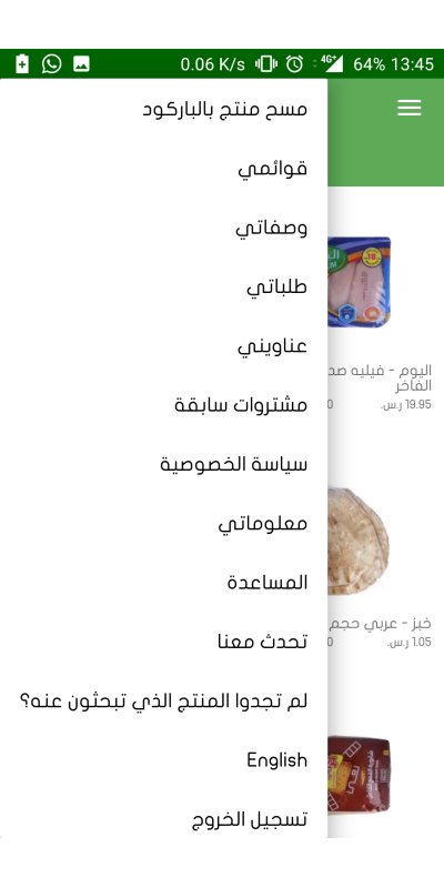
I used the barcode scanning tool in the menu before, and I was fascinated, it actually picked the item in our living room. I love this feature and think it's a big factor for me in this app. It's a big plus for users. I really hoped it would be featured clearly, not hidden in a menu. This looks like a competitive advantage that can be used, yet it's misplaced!
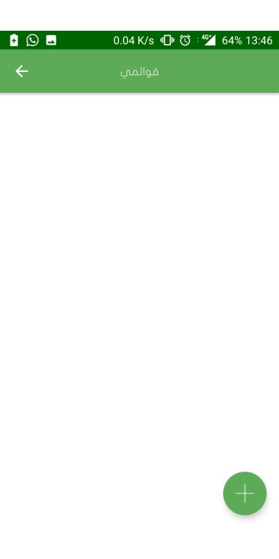
I went to my lists, and this is what I saw, I'm still bamboozled.
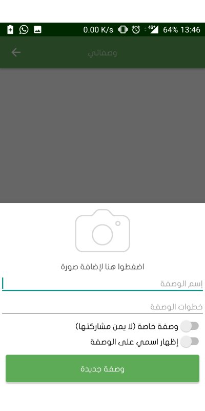
So I went to recipes, while it was still white and empty, I said let's try to add something and the input page is so uninviting to fill, I decided to ditch it.
You should always have something like a placeholder in these places to invite the user to do something, and with a usable form.
Orders page is also empty and looks weird. An idea is to put a text that says that it's empty, why don't you fill it? And then add a button to take the user to the shop, maybe also invite them with a coupon.

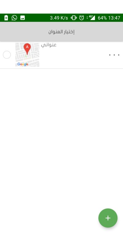
I went to see my addresses, and was happy to see the one I added earlier there, but what I wasn't happy about is that what seems like three dots list doesn't work. Then guess what, even the checkmark field doesn't work. Both of them route you back to the shops list. It's a weird frustrating feeling.
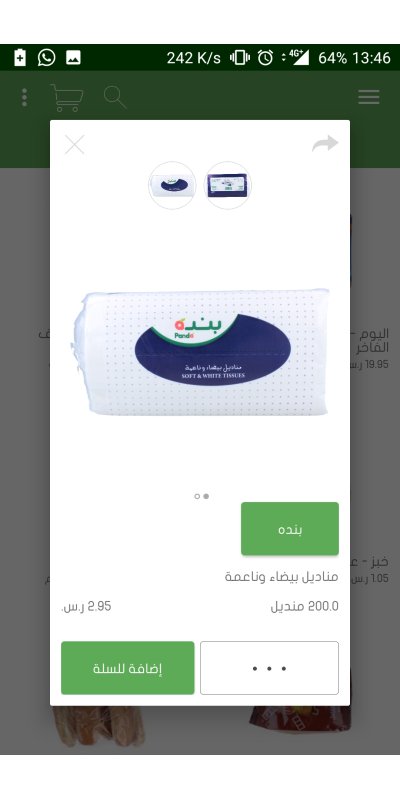
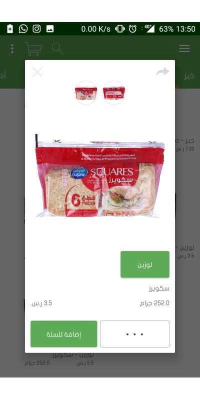
This is what a product page looks like, it's alright. I don't hate it but it's not really interesting.
So I wanted to add it to the lists...
Let's take a step back, checking the shop's list, and tapping on one of them opens the subcategories, which is also a normal and decent move.
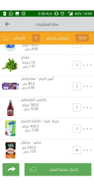
This is what a shopping cart looks like.
I enjoyed the top bar count and total price, a nice move.
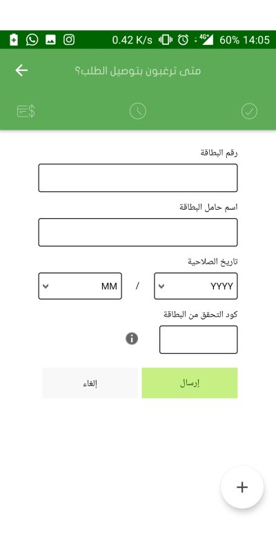
Decided to order, there's only one option, which is COD.

But then I clicked on the add button in bottom and boom I get a form to fill my credit card info.
I just didn't understand what to do, so I backed up and used COD.
They apparently offer your order to the pool of drivers for a minute and half, and you see the countdown timer, a ticking bomb.
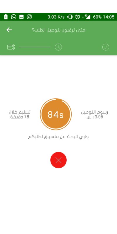
But guess, what my order has been picked up!

The application sent me few empty notifications, which I don't welcome or like.
There is no mechanism to deal with products that aren't found, unlike Danube or Nana which offer the option. My phone was on silent, and the driver kept calling me for 10 minutes, and when I answered he was pissed, which I'm not mad about, but the fact that he has to wait for me to answer him so I say oh okay, get whatever milk is there is a ridiculous idea.
There's a lot of weird behavior and interactions which makes you feel like this app is a functional prototype and not a final product.
The application feels like something that's in alpha stage, and if that's the case, I wish them best of luck.
But I didn't like my experience, and I really hope they improve that.